Thursday, March 25, 2010

Master Assignment


So. Although not everyone has finished their assignment, this week all works of art have to be finished. Since it's Thursday we're already looking at some of the work people have been working on the last couple of weeks. In their free time. Isn't that something? We thought it would be nice to have a little Q&A with Jeremy Hoffman, one of our Graphical Artists.


First question: The first step you have to take in order to create a Master Assignment is to write a short story. What was your story?
"Pirate Kid and his best friend Mun-Kee find a treasure. A treasure filled with gold and jewelry. You know, a real pirate scene."

OK! That sounds like a lot of fun! So how did you go from there?
"At first I didn't know where I wanted this to go. Did I wanted it be more action-oriented, with fighting pirates and swords and stuff or should I go for a more static image? In the end I felt the more static one would be a better option, because I wanted to focus on the emotion of that single moment and felt that too much action would take this into a entirely different direction. I wanted a bigger focus on their friendship."

Treasure? I don't see any treasure?
"There is no bigger treasure than friendship HAHAHAHAHAHAHAHA APPLAUSE!!!!!!!!!
No, seriously. I started out with the treasure idea, but found that the emotion of finding a treasure would stop right there. They found it. Period. Their friendship however lasts much longer and is more interesting. Something the audience could relate to in a stronger way."

So you can change your assignment?

"Yes, we can. The assignment has to work for me. And what is also very helpful is that this image has become a clear and simple image which gives me a better overview of what to focus on. Now I don't need to worry about 21 different things, but I can concentrate on a few."

After each Master Assignment you have to define 6 areas where you have to focus on during the coming 6 months before starting your next Master Assignment. Although this isn't your final work, are there already any improvements to be made?
"Well, of course. Although I got some great response from people here at the studio, there is one thing I can already mention. In the process I added color, for color study. Although I'm pretty convinced these colors might work, I noticed something else. To let the audience fully enjoy the boy and monkey's little moment, it is very important that you can 'read' the image well. To show you what I mean; I blocked in the silhouette to check his shape.I found that there were some improvements to be made. You can see that the clearity of his shape gets weaker in the colored version with the green/blue background. This shape should be as simple and clear to read as in the black silhouette version. Furthermore, the silhouette should be clear as well. Ideally you would want the viewer to understand what they're seeing, even in a black silhouette version. I think that focussing on shape is going to be one of my focus points."

Thank you Jeremy for your time.
"You're welcome!"

If you want to follow this art process or see his other great artwork you can go to Jeremy's blog.
See you with another Master Assignment update next thursday!

Wednesday, March 24, 2010

Master Assignment


Don't forget! Tomorrow (every Thursday) is our Master Assignment day! I've seen some great stuff so don't forget to check back!

Tuesday, March 23, 2010

EDGE!


Just wanted to let you know we have a nice article in Edge magazine; April edition.
We're called GameHouse Studios...Don't ask...it's a long story.

One Year Anniversary


Coming month it's been already one year since we finished the first teaser video for Emily's Taste Of Fame. The video was almost banned because of let's say some explicit sexual behaviour like touching a cows udders. Oops, there, I said it again. Udders.
Anyways, by many already considered a classic. Enjoy it. Before Big Brother takes it off the internet...again.

Monday, March 22, 2010

FMX '10

Last year me and Sebastiaan van Waardenberg (our gamedesigner) went to FMX '09 in Stuttgart. An Internationl Conference on Animation, Effects, Games and Digital Media with speakers from all around the world.
It was a great trip (I'll spare you the details, but trust me, I can still remember it) and Stuttgart is a great place as well. We went to see the "Art Direction and Lighting of Bolt" (from the Walt Disney Animation Studios), Storytelling and the evolution of a shot by Chris Williams (also from Disney) and the great Syd Mead who, by the way, is full of himself beyond belief.

Anyways this year (May 04- May 07) and I quote straight from their newsletter:
++ More top notch speakers confirmed +++
FMX is glad to welcome Daniel Jeanette, Animation Director and Visual Effects Supervisor on “Where the Wild Things Are” and Simon Otto, Head of Character Animation for DreamWorks’ “How to Train Your Dragon”.
Other newly confirmed speakers are the Stereoscopic Supervisors Jayme Wilkinson (“Ice Age 3”) and Anthony Shafer (“Christmas Carol”). So If you want to go don't hesitate. It's not that far and...
they have great schnitzels!

Thursday, March 18, 2010

Master Assignment II

These are character sketches for the upcoming first Master Assignment by Dirk van Dulmen. Like we promised, every Thursday we´re giving some attention to the progress by putting some sketches up for eternity. The first Master Assignment is due the 26th.

The BOX!

So we've just opened the box (honestly!) and this is what was inside.

The Animator's Survival Kit from Richard Williams! Now you know what's inside the box I bet you want to know what's on those dvd's right? Well you should definetely watch this clip.
He worked with the greats (like Milt Kahl) and passes on his knowledge in the most inspirational way thinkable!

Wednesday, March 17, 2010

One package to rule them all PART 3!


Inside the box there was this envelope...now I'm getting really curious! I can't stand it any longer!

Barking pussy


So excuse me. Just came back from the art department, it's a 10 minute walk, and this is no barking dog...it's supposed to be a barking pussy!

Color layout


One of the discussions during our sprint meeting was wether to spend time creating an overview of the work that needs to be done or to just begin producing. This sounds obvious, but is always a talking point between the producer and the art department. Stuff needs to be produced and time is always of the essence. We had a firm discussion (that maybe explains the barking dog...) about designing character poses in 2D instead of doing that same thing in 3D. This takes time of course, but eventually should win us some time and not to forget quality. What do you think?

This color layout is also a nice example. It's an overview of the mood that every area should convey. So not particularly the color of the area. If we would begin with the second area without laying out the overview, chances are that the second area would not look like the first one just to look different. If we do it with an overview, it gives us control and a chance to play around with mood flows. Which of course is very important if we want to create a moving experience for our audience.

The yellow stands for sunshine, for life which in our game stands for fertility. So that area will contain images, and not to forget gameplay that will have to do something with creating life...

One package to rule them all PART 2!


So surprise, surprise! Another box...

Tuesday, March 16, 2010

Sprintmeeting


Yesterday we had a sprint meeting which was very exhausting. Sprint meetings are a part of agile development, the way we develop our games. Anyways...like I said, it was exhausting and it made some people draw pretty pictures of how inspirational other people were getting...by the time it got dark outside some of them even looked like sleeping cats...however... I don't recall anyone looking like a barking dog...

One package to rule them all


Another memorable day in the history of our studio. The package of all packages has arrived and we are all very excited about it. (Talking about understatements...) This is truly the gift of gifts, the shit of shits. You want to know what's inside?
Check back tomorrow...I'm sorry for that;)

Friday, March 12, 2010

Welcome!


We're not only trying to bring a little joy into the lives of our audience *sigh* but we do our best as well for everyone here at the office. This lady is the first 'thing' you see when you enter our office or, if you by any chance missed her, that scares the living crap out of you when you turn around after sitting in one of our comfortable chairs...Isn't she GRAND?

Thursday, March 11, 2010

Master Assignment

From this month on every artist in our studio will be working on a Master Assignment. A new MA for each half year which we'll bring to your attention every thursday. Our artists will give themselves an assignment to train their skills up to a level we couldn't even imagine possible!
Last week Jeremy Hoffman started these sketches but already threw them away! So stay tuned if you want to find out what's next!

Wednesday, March 10, 2010

Emily's changing faces & features


Some of you may know this girl as she's the face of our hitseries Delicious. Her name is Emily. Over the years she has gone through some changes in the developing process. Every design has been reviewed by our target audience, so don't blame us if you like her hair shorter, or for making her pregnant, uhmm...I mean for not making her pregnant...

Tuesday, March 9, 2010

Out with the cold...

Although this is very old and outdated concept art, it has become topic of the day yesterday because we're only one week away from spring and it was actually snowing!
So I say: Out with the cold, in with the woo!

Monday, March 8, 2010

The Tree Sessions

A.K.A. GameLab part 3
As we said before, we would post our findings very soon. Well, that day has arrived.
Last week the studio discussed the differences between pencil sketches and the final artwork. One of those differences is that the 'weak' areas in a pencil sketch always show when you turn them into color.

Today we had the pleasure of finding these great recreated pans and layouts from the ‘golden era of animation’, from disney’s DONALD DUCK short OFFICER DUCK. I took the unrespectful liberty to cut and paste the tree from that pan to show the black and white, the pencil and the final version next to each other to see the process.
The small differences between pencil and color show that in the painted version (both B/w and colored) you can really see where branches are going and with that where the tree is going. It really makes the design better and clearer to read.

Although the foliage remains too solid, the question is, if we adjust one of our own tree sketches according to these 'clearity' rules, does it become better and clearer to read?

Thursday, March 4, 2010

And another one down...


Sometimes the great artists in our studio create artwork that is, for some mysterious reason, not what we are looking for. Like these character sheets for one of our games we're working on right now. Can you imagine that? Anyways, they're too good to throw away, that's why they have been preserved for eternity by ZAPC-the Zylom Artwork Preservation Committee.

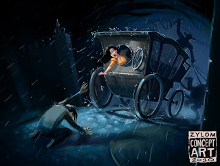
OooH! Noooooooooooo!


Have you ever felt like someone who's been taken away from a beloved one by a mean old dark figure riding a carriage? Well, if it looked like this then I hope you feel better now...

Wednesday, March 3, 2010

Gross language...


Thanks to our friends from cartoonbrew, we came across this great piece of art history.
As long as we only have guys working in the studio, we won't be seeing these notes any time soon...

Tuesday, March 2, 2010

concept ART


Well...HERE IT IS!
From now on, our concept art is wearing the zylom concept badge. Just so you know...