Friday, July 30, 2010

logo designs


If there's another thing that is keeping us busy is the logo design. This is from a phase we are thinking of the design and the name at the same time. go figure...

nice stuff from popcap


Posting popcap wannahaves is not going to be a regular item;) but we all were very impressed with all the nice toys'n'things we received here at zylom. check this out!

Thursday, July 29, 2010

more background stuff part 2


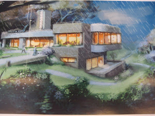
Okay, so we're still fighting over the title of Private Care. This week we thought it would stay "Private Care", but 'the man upstairs' (which sounds very much like another game that is in production right now) decided otherwise. In the U.S. private care means something different than what we want it to mean. So...please enjoy the view while we try to come up with a new title.

Monday, July 26, 2010

Clay Emily

Because we are about to start working on Delicious 6 we decided it was a good idea to finally get the full potential out of Emily as a character. Considering the sequels to come and the possible platforms, Dirk van Dulmen began his work on Emily in some obscure farm somewhere in France. Here's the making of Emily, version 1. For a first draft this looks already a lot like Emily!

Friday, July 23, 2010

more background stuff


We're doing the finishing touches on Private Care and we finally founs some time to show you some amazing background art. Because we are not giving it all away, we'll let you decide which one is final artwork.

Friday, June 11, 2010

Private Care Preview!


If you are curious what GameZebo thinks of our alpha:

We're always excited to check out the latest game from GameHouse Eindhoven (the Netherlands-based game studio formerly known as Zylom). The creators of the Delicious series always seem to put out quality games with plenty of ...

check: http://www.gamezebo.com
And stay tuned if you want a piece of this because interesting things are about to happen with this game and it's promotion.

Wednesday, June 9, 2010

Private Care

It's been a week now since Private Care has met the public's eye for the first time and they even seemed to like it! (pffew!)

Our betaboard has given us enough feedback to make this even a better game.
One of the comments was: “A different genre than I usually go for but I loved the fact that I actually felt under pressure to perform. I dived right into the story line - well done!!!”

One of the 'rules' we live by during development, is that we try to push our artwork. If you already felt 'under pressure' playing the game this is how we could graphically push the experience even to a higher level...
please note: These animation are for testing purposes; they are made with flash.

Monday, May 17, 2010

Where the wild things are

It may not come as a surprise to you but some of us still haven't seen Where the wild things are directed by Spike Jonze. What some of you don't know (except for the people that do...there always are...)is that John Lasseter from PIXAR directed a CG test for Disney in 1983. Yes, that's right, 1983. In a land before time...

In my search for inspirational presentations I came across this one:

Master Assignment


Because we missed some thursdays, here's another episode in the Master Assignment series. For more background information on this piece, feel free to visit the artists blog.

Tuesday, May 11, 2010

Frank Frazetta R.I.P.

Monday, May 10, 2010
Frank Frazetta 2/9/28 - 5/10/10

Thursday, May 6, 2010

Elemental Magic


At the moment we are working on our opening scene of Private Care where it's raining. To make sure that the rain feels like rain, with raindrops splashing on the street and splashing on water pools we consulted "Elemental Magic", The art of special effects animation, by Joseph Gilland.

It's always reassuring to read that there are companies out there with special effects departments dealing with issues like how waves crash into a hawaiian beach or-in our case-how rain crashes in on crashed cars.

Thursday, April 29, 2010

Next Please!


Programmer´s Wanted! it´s a thrown away concept...back to the drawing table

Cintiq review!

As you all know, we are using a cintiq since February. Ofcourse you are all dying to know what we think of it? We'll break it down for you: Our cintiq review!

pro's:

-You have more control over your linework. It's more precise and it works faster.

-You can draw more intuitive like working on paper. And it has different pen points, to compensate the feeling that you're drawing with a pencil on a glass window.

cons:
-The screen gets f***g hot! Well, that's a little bit exaggerated, but it sure feels like asphalting a highway on a hot summer's day, and it leaves you with a burning sensation on your face without getting a tan.

-Your workflow changes, because you don't have 'relative' distances anymore. Compared to your wacom tablet, which is proportional to the screen, you can point to any spot on the screen without picking up your pen.

-Righthanded people using the right mouse-click cover the drop down menu with their hand and need to learn left hand typing, because of the keyboard positioned on the left side of the cintiq.

overall: it needs time to relax while sitting behind a cintiq and it literally is a rotatable canvas!

advice: BUY MORE!

New Cintiq!


Look! a new cintiq! our second one. And as you can see our artwork gets better by the minute...

Monday, April 26, 2010

No more Mrs. Nice Guy!


Maybe someday...

Some concept art

from private care, when private care was still a little baby...

Some concept art


from private care. It's the clinic. We also got one on a sunny day. We create these concepts to make this world alive, get a sense of scale and volume. It's basically to see how we can make a hospital feel heartwarming and hospitable.

Some would say: A Hospital is no place to be sick. Well, we created a place where you want to be sick and maybe even stay a little longer...

Thursday, April 22, 2010

First sketches for a revolutionary script!

taken from our game Private Care.

Master assignment


This Master Assignment episode is mainly about gesture drawing. Walt Stanchfield is full of it. I should was full of it. In the 1970s, Stanchfield focused his efforts on establishing a training program for new animators along with veteran animator and director Eric Larson. Stanchfield held regular weekly drawing classes and lectures for the crew, and among his students were young talent that went on to become prominent figures within the animation industry: Brad Bird, John Lasseter, Don Bluth, Joe Ranft, John Musker, Ron Clements, Glen Keane, Andreas Deja, and Mark Henn, among others. In The Walt Stanchfield Lectures: Volume One, chapter 39, page 79: "In our class, time and again there has been a pose where the model, having brought a prop, has built a pose around the prop; for instance, opening an umbrella. Last week, 5 minutes into the sketching, there were, out of 17 drawings, only 3 or 4 umbrella's sketched in. The "first impression" should have been "woman opening umbrella".

So if we look at this sketch of a heron, there should be a reason for him to act and pose the way he does. His 'umbrella' is obviously out of this frame. We'll look into that the next week.


Wednesday, April 21, 2010

And in the category...

INSPIRE OR GET INSPIRED...: